
Created a vivid visual image that accurately hits the target audience and reveals the core ideas
Client:
«VegaBurger»
Country:
 UK
UKProfessional field:
Vegan fast-food
Problem
- The goal was for the product to gain popularity within five years in the UK and within ten years in Europe.
- The business model centers around offering healthy and delicious fast food at an affordable price for the mass market.
- It's worth noting that many vegan restaurants in this market already offer delivery services and have larger budgets for promotion.
Tasks:
- Exploring existing British vegan fast-food brands to identify a niche.
- Developing a product brand that resonates with a broad audience.
- Designing a logo, corporate identity, and crafting a brand concept.
Scheme of work:
Step #1:
We conducted a comprehensive analysis of the target audience, identifying their primary emotional needs, the decision-making process, and the key considerations that precede a purchase.
Step #2:
Our research revealed that all product suppliers were essentially the same, highlighting the essential need for a strong brand to establish a foothold in the market.
Step #3:
Through competitor analysis, we identified a market gap for the company to occupy.
Step #4:
We determined that the most effective way to influence the target audience was through visual components, including a logo, corporate identity, and advertising layouts.
Step #5:
Using these tools, we conveyed the brand concept, highlighted our distinctions from competitors, and reshaped the perception of fast food to be synonymous with eco-friendliness, health, and proper nutrition.
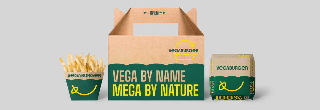
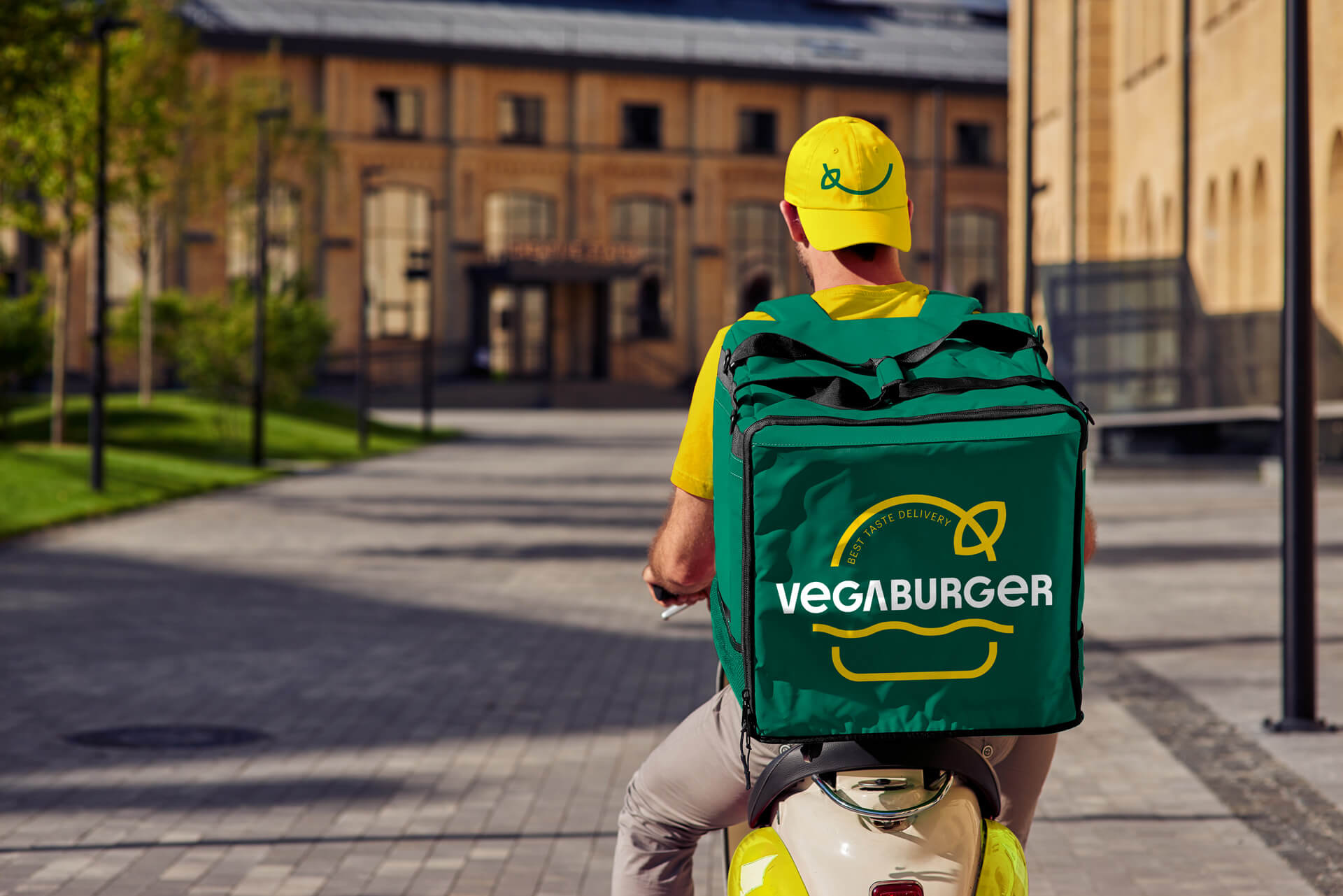
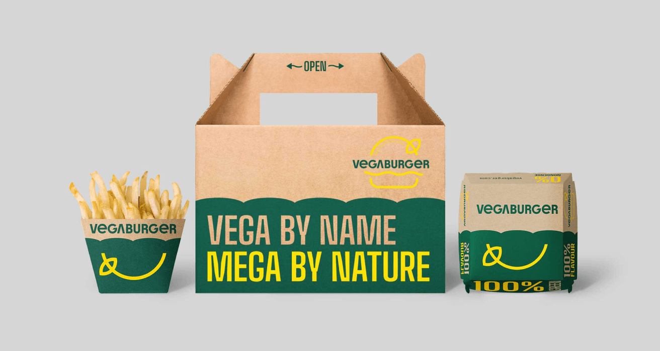
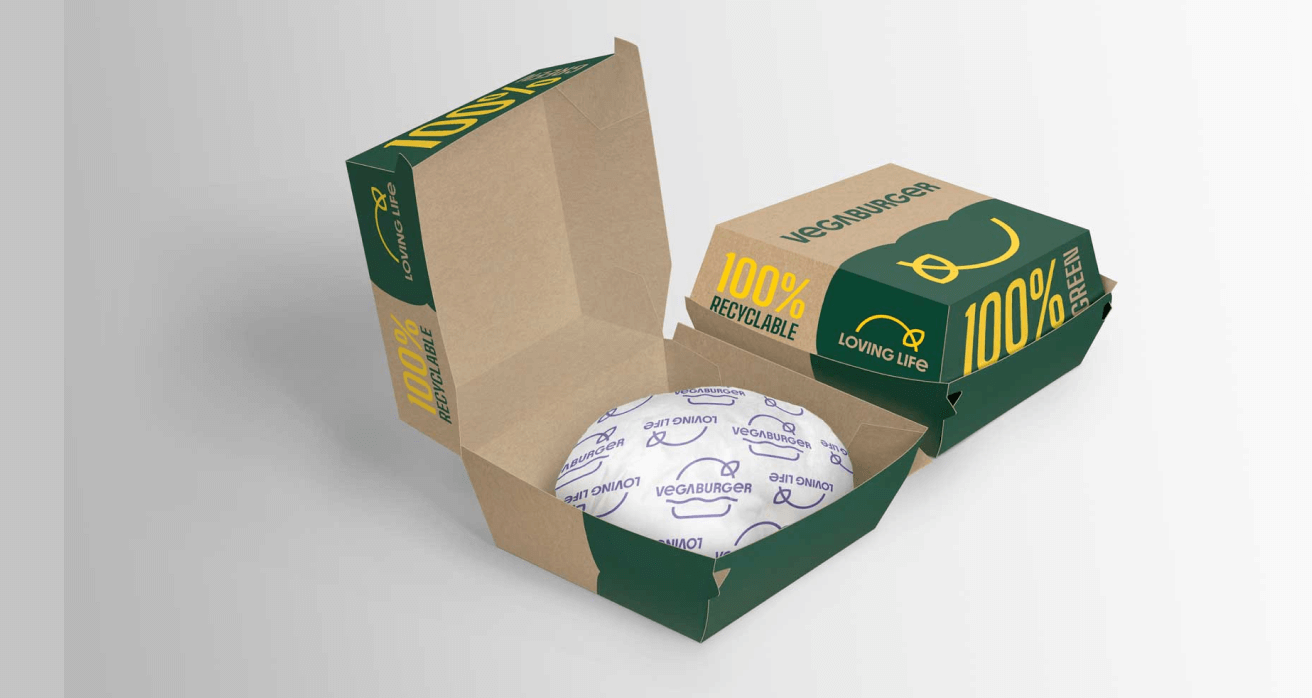
Solution
Based on the analysis, we opted for colors that deviate from the typical choices in the sustainability category.
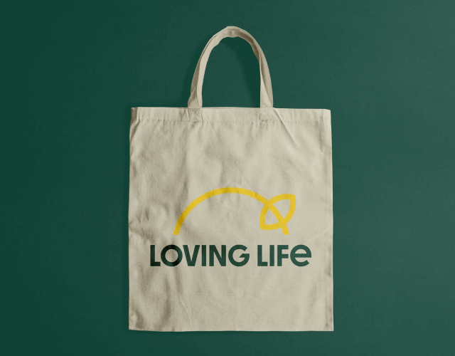
In the development of our brand identity, we intentionally eliminated graphic elements associated with foliage, nature, and similar motifs.
To maintain brand continuity and recognition, we retained the restrained logo font style.
Additionally, we designed a distinctive emblem that facilitates easy branding on the client's technical assets, enhancing brand visibility.
Results
- We established a brand platform and target positioning rooted in our research and data.
- We crafted a vibrant visual code that resonated with the target audience, effectively conveying the brand's core concepts.
- Furthermore, we laid the groundwork for a swift launch and secured a share of the fast-food market.