
Increased brand recognition by 45%
Client:
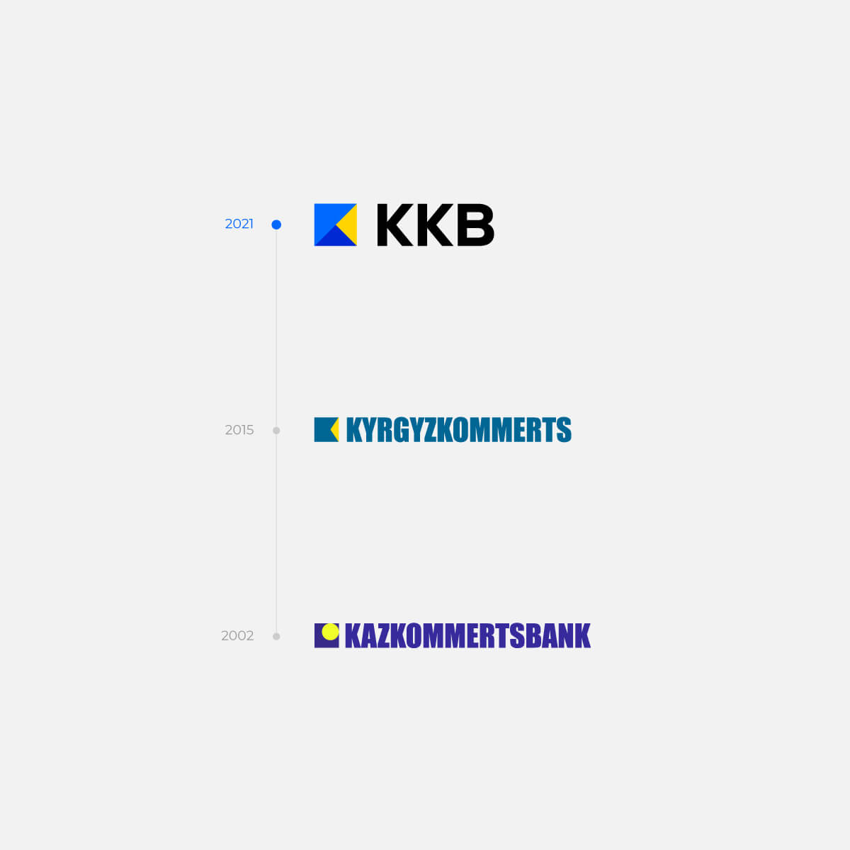
«Kyrgyzkommertsbank»
Country:
 Kyrgyz Republic
Professional field:
Banking
About the client
- The bank has new remote services
- The service has become more convenient for customers: we need a rebranding to emphasize it
- It was necessary to focus on the mobile app and online financial transactions
Tasks:
- Exploring the banking sector in the Kyrgyz Republic
- Rebranding based on the received data
- Enhancing the awareness about technological services and solutions
Scheme of work:
Step #1:
We identified the primary competitors in the banking services market and collected essential information about them, encompassing their history, services, financial statements, and market share.
Step #2:
We conducted an in-depth analysis of their marketing strategies, advertising tools, and their respective effectiveness. Based on this analysis, we formulated a competitive strategy and identified potential product improvements.
Step #3:
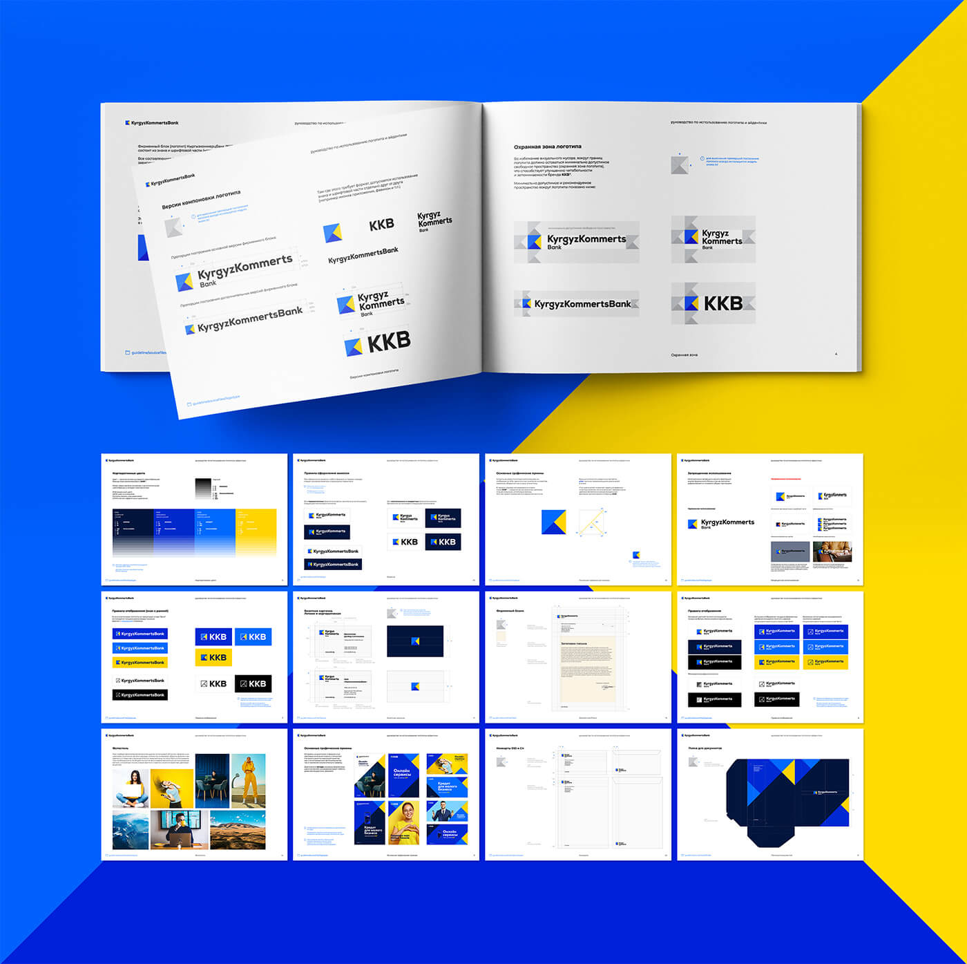
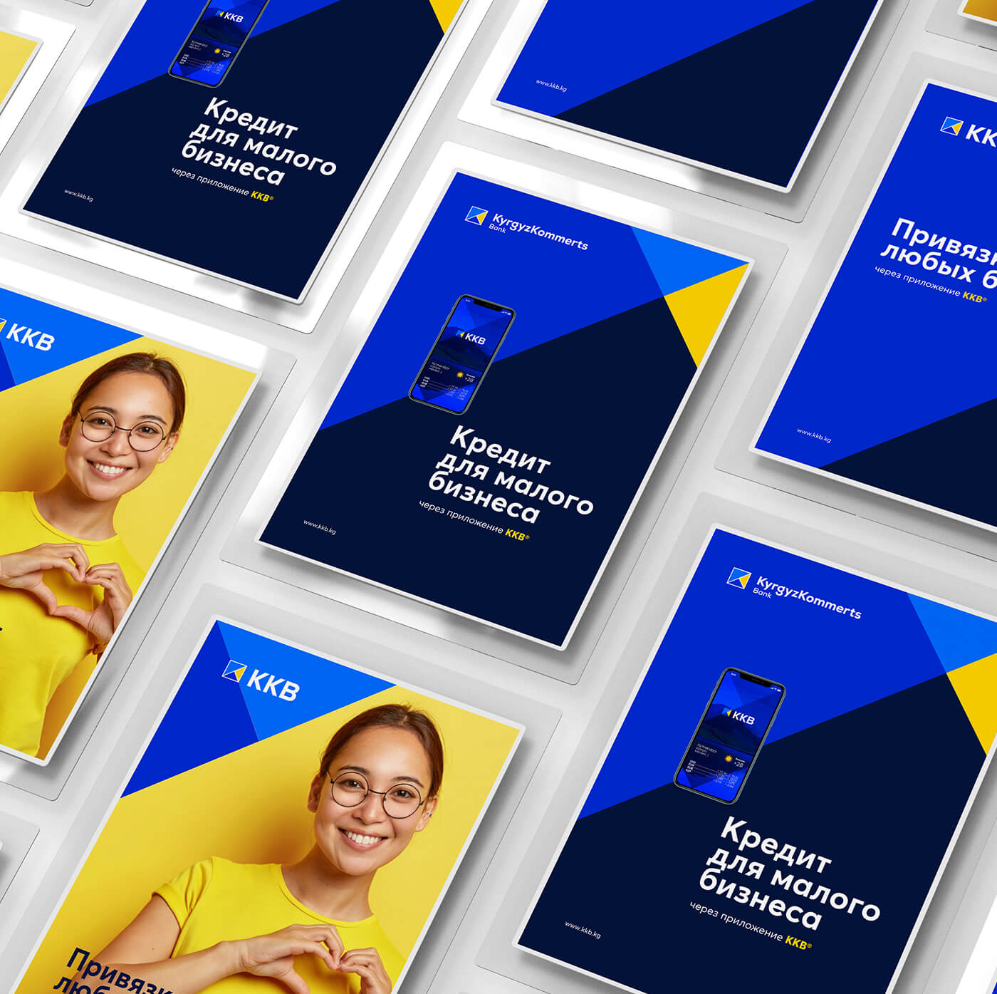
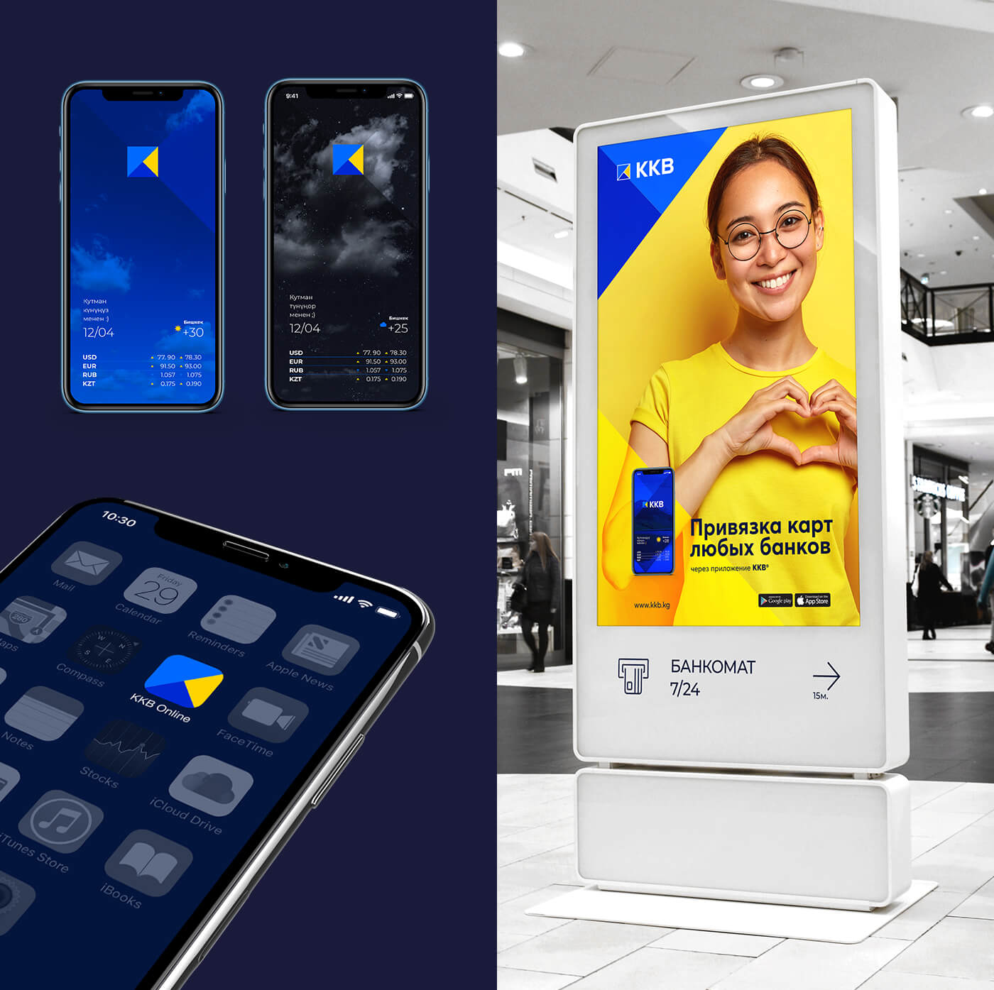
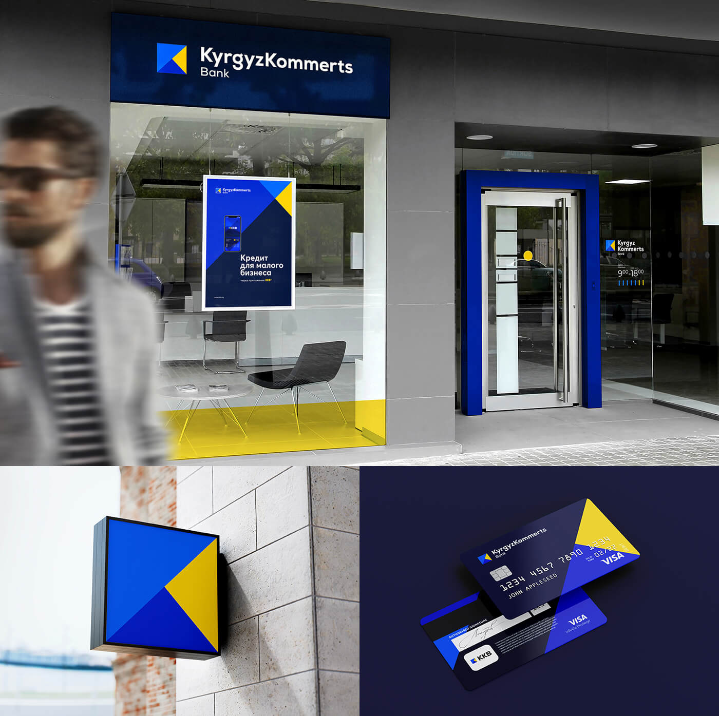
We created a comprehensive brand platform, complete with visual components such as a logo, corporate identity, and media materials.
Step #4:
We developed a brand positioning strategy, aiming for customers to perceive Kyrgyzkommertsbank as an innovator in the banking services market – a personal assistant for everyday financial matters, providing services and products that enhance convenience in their lives.
Solution
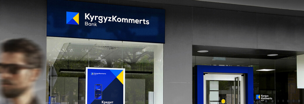
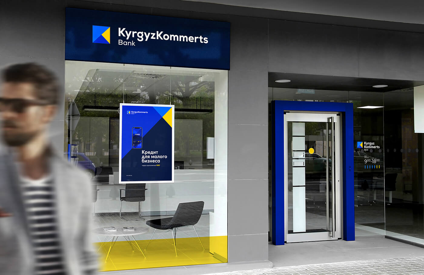
The research indicates that a transition into a digital bank necessitates a mandatory transformation of the bank's external image.
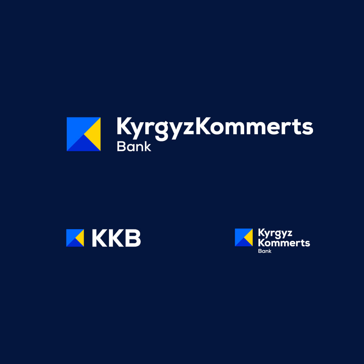
The new style and logo should reflect a complete shift in the bank's direction and its firm commitment to the path of digital transformation.
The corporate color palette comprises four primary colors: dark blue, Majorelle blue, sky blue, and digital yellow.
The updated logo uses the Nexa Heavy font, which is modern and friendly, with a sans-serif design that complements Kyrgyz, Russian, and English languages.
Results
- Customers now view Kyrgyzkommertsbank as a modern and innovative digital bank
- The awareness of the rebranded brand surpassed our expectations, increasing by 45%
- The bank saw a 30% rise in the number of customers compared to the period before the rebranding