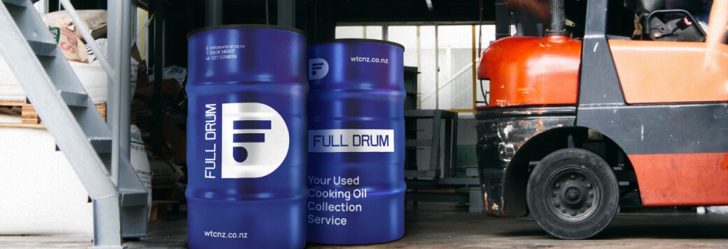
Made the brand stand out and evoke associations with environmental friendliness and convenient service
Client:
«Full Drum»
Country:
 New Zealand
Professional field:
Deep-frying oil processing

About the client
- The oil undergoes processing to produce biofuels and is subsequently recycled.
- The company collaborates with a diverse range of businesses, including restaurants, cafes, factories, and food trucks.
- To enhance operational efficiency, the company utilizes unique software to monitor the capacity of containers.
Tasks:
- Our process began with an in-depth analysis of the market, competitors, and the target audience.
- Recognizing the need for a fresh approach, we embarked on updating the current corporate identity with a strong emphasis on the brand's unique properties. This comprehensive effort included developing a brand book, identity refinement, and rebranding
- The overarching objective was to effectively differentiate the brand from its competitors within the market.
Scheme of work:
Step #1:
Prior to initiating the project, we conducted a thorough analysis of both direct and indirect competitors, delving into their websites. Additionally, we considered the dynamics of the local New Zealand market and global trends in food safety and processing.
Step #2:
We identified distinctive features within the local market and formulated a hypothesis for advancing brand identification, particularly from a visual standpoint.
Step #3:
Leveraging the brand's unique attributes, we crafted a fresh corporate identity.
Step #4:
Our primary focus shifted towards updating the color scheme. Colors play a pivotal role in setting the brand apart from competitors and evoking the desired emotions in the target audience.
Step #5:
Furthermore, we compiled a brand book that outlines the guidelines for utilizing the brand's corporate identity, encompassing elements such as the logo, colors, typography, and more.
Solution
Based on the analysis, we made the decision to use colors that are atypical for the sustainability category.
In developing our brand identity, we deliberately abandoned all graphic elements associated with foliage, nature, and similar motifs.
We retained the restrained logo font style to maintain continuity and brand recognition.
Additionally, we created a distinctive emblem that simplifies branding on any technical platform owned by the client, thus enhancing brand visibility.
Results
- Following the rebranding, the company significantly strengthened its position in the recycling market and extended its reach.
- Customer numbers surged by 20% compared to the period prior to rebranding, as the brand effectively set itself apart in the market, invoking associations with environmental friendliness and convenient service.

